Itihāsa Tattva
Ancient Indian thought, arranged for modern reading.
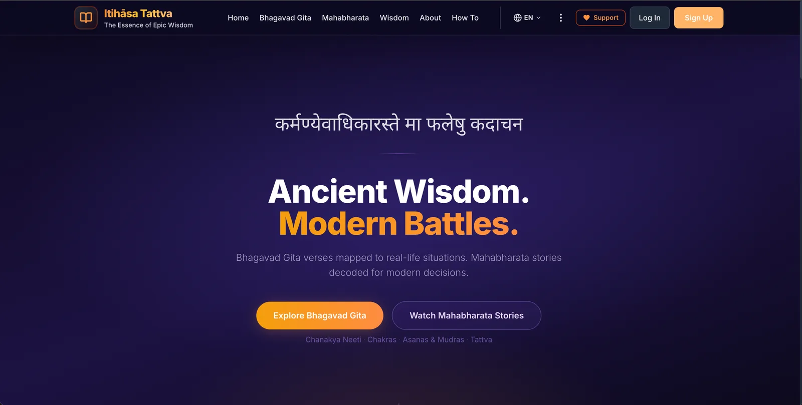
The problem
Long-form writing about the epics and classical Indian thought usually ends up as dense PDFs or blog templates that flatten the material. The publication needed an interface that could hold long essays, Sanskrit terms, and cross-references without making the reader work for it.
Constraints
- Essays run long; the reading system had to sustain attention across thousands of words on a small screen.
- Mixed scripts and diacritics — typography had to render Sanskrit transliteration cleanly everywhere.
- The material deserves patience, not engagement tricks; no infinite scroll, no interruptions.
The approach, in order
- /01
Designed a long-form reading system first: a generous measure, a calm type scale, and clear section rhythm.
- /02
Structured the architecture around essays and their relationships, so the site grows as a body of work rather than a feed.
- /03
Chose typefaces and rendering settings that handle diacritics and transliteration without fallback glitches.
- /04
Delivered as a progressive web app so a reader can install it and pick up where they left off.
What it does now
Bridges long-form culture with modern UX without flattening it.